Share
While maps can deliver complex information in a simplified, easily digestible form, Seppe Cassettari suggests that more work is needed to ensure they convey clear messages in a rapidly unfolding pandemic
My usual approach to writing these articles is to draft, leave, revisit and edit. This one I have left until the very last moment before the editor’s deadline. The reason is that it should, and must, reflect on the current COVID-19 situation, even though by the time you read it things will inevitably have changed.
So it is the first week of June here in the UK and we are just starting the process of easing lockdown and beginning to adjust to a ‘new normal’ - social distancing; restricted travel and, for many, a different way of working. The number of reported cases worldwide is now over six million and more than 370,000 people have lost their lives. The UK has 276,000 cases and 39,000 deaths at the time of writing, and these numbers are bound to understate the true extent of the pandemic.
Seeking certainty
In order to keep ourselves safe, we have all become avid consumers of information about the spread of the virus, from the daily government briefings to the multitude of on-line news websites. We are hungry for the latest developments and desperate for certainty in uncertain times. So much of what we read and hear is opinion or speculation, but we often interpret it as fact in a bid for clarity on how we should respond.
It is therefore interesting to see how much mapping is being used to communicate how the world is affected by the virus and the consequences it has for us all.
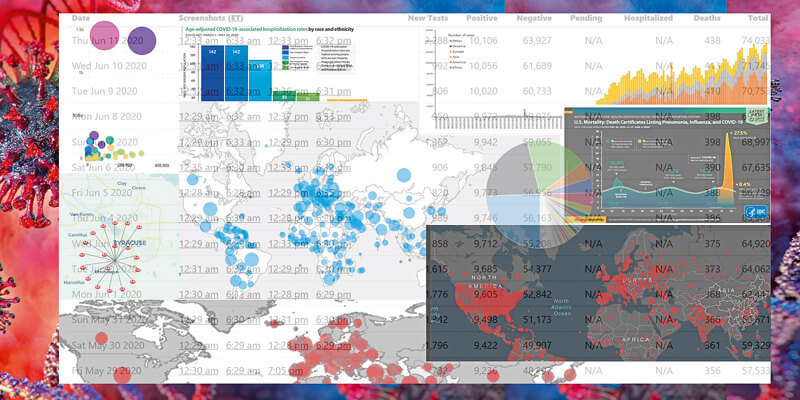
I check-in on the simple maps produced by the BBC on a daily basis to the spread of the virus around Europe, augmented with various graphs on how individual countries are reporting the number of infections and fatalities. I, like many others, often gain more from looking at a map than a simple table alone, appreciating how geographic context plays a part in our understanding of a problem.
Snapshots in time
Yet most of the maps that are widely disseminated to the public are very simple. In many cases, overly so. They are snapshots in time and do not reflect changing realities, country by country or region by region. Global maps showing the number of cases by country using proportional circles is a common approach, e.g. maps compiled by John Hopkins University and published on the BBC News website. Then there are choropleth maps with poor choices for the colour range used or the class boundaries.
The world maps often look cluttered and difficult to interpret. To make sense of them you have to drill down to smaller areas. The use of proportional circles or choropleth maps can be a fairly simplistic response to a complex data problem involving different data collection methods, levels of testing and varying reporting criteria. The absolute numbers have a context within the local population that the maps fail to reflect.
I spoke with Paul Naylor from Ordnance Survey, a fellow Council member of the British Cartographic Society and someone who’s opinion on map design I respect. After a quick web trawl, he came up with a series of maps from different places that show many of the pitfalls of using maps as a communication tool. If not confusing, some maps can be regarded as misleading or even, as someone might have said, “fake news”.
Creating good cartography to reflect the pandemic is not simple. It must be easy to read, with a simple level of detail. The message needs to be easily interpreted, as most people will not dwell on it to extract hidden nuances. Yet the data is complex and rapidly changing, and the maps generally reflect but a single point in time.
Some of the maps are far too simplistic and really show nothing of value. Others are overly complex and the method of presenting the numbers is cluttered at best, often by superfluous design. In one map of the world, Europe is swamped with overlapping symbols.
Getting it right
Of course, There is the question of whether or not the public can effectively read a map, and where the intention is to reinforce a simple message. It begs the question: are maps a good means of conveying a clear, understandable message, and do they help achieve compliance by the wider society? They can be … if done right.
There seems to me to be a need for two things. The first is for better quality maps that help communicate the message. And here, cartographers need to play a more active role and some of the GIS solutions used to create the maps need better cartographic tools.
Of course, this raises another issue – good mapping is somewhat dependant on having good data. A map may be cartographically excellent but communicate completely the wrong message if the data used to compile it is poor. Getting the balance right between good data and good cartography is one that is difficult to achieve. As an industry, we need to do more to get a broader understanding of the issues involved.
The second issue is the need for better education of everyone, both on the way maps work and how to interpret them. This starts in schools, and the reintroduction of maps into the school curriculum is to be welcomed. But we also need to ensure that maps do not contribute to ‘mis-information’ in being difficult to read or understand.
In some ways, this feels like a very old refrain from the initial days of GIS. But I’m not sure we have made that much progress. There is plenty more to do!
Dr. Seppe Cassettari is a GIS professional, with more than 25 years’ experience in developing and applying geospatial technologies in the public, private and educational sectors. He was most recently CEO of The Geoinformation Group (now Verisk’s Geomni UK business)